Color is an essential element of design, art, and even daily life. Understanding color theory can help you make better aesthetic choices, whether you are a designer, artist, or someone looking to improve their sense of style. In this beginner-friendly guide, we will explore the basics of color theory, including the color wheel, color harmonies, and the psychological impact of colors.
I have written 3-3 drawing ideas for the different color harmonies and created some illustration for you to use as inspiration.
At the end of this post, you will find a free downloadable color theory practice sheet to help you create your own color wheel and make your own color palettes.
Basic Color Theory for Beginners with Free Color Theory Practice Sheet
Pin it to save this post for later ⬇️
The Color Wheel
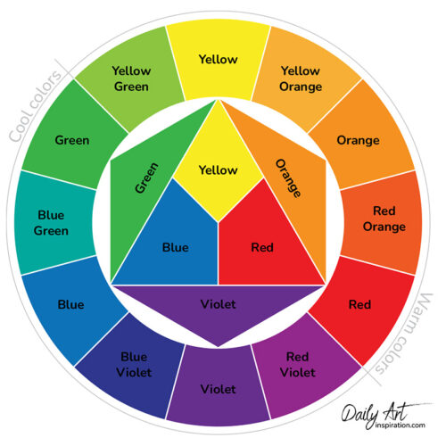
The color wheel is the foundation of color theory. It is a circular diagram that organizes colors based on their relationships. The primary colors—red, blue, and yellow—are the building blocks of all other colors. When mixed, they create secondary colors:
- Red + Blue = Purple
- Blue + Yellow = Green
- Yellow + Red = Orange
Tertiary colors are formed by mixing a primary color with a secondary color, resulting in hues like red-orange, yellow-green, and blue-violet.
Color Harmonies
Color harmony refers to aesthetically pleasing color combinations. Some common harmonies:
Monochromatic Colors
Different shades, tints, and tones of the same color, which result in a sophisticated and cohesive palette.

Drawing Idea 1: A misty mountain landscape in various shades of blue.
Drawing Idea 2: A rose with different tones of pink and red.
Drawing Idea 3: A portrait using only shades of green.

Complementary Colors
Colors that are opposite on the color wheel, such as blue and orange or red and green. These combinations create strong contrast and stand out.

Drawing Idea 1: A vibrant sunset over the ocean using blue and orange hues.
Drawing Idea 2: A red and green parrot perched on a branch.
Drawing Idea 3: A purple flower with a yellow butterfly.

Analogous Colors
Colors that are next to each other on the color wheel, such as blue, blue-green, and green. These create a harmonious and cohesive look.

Drawing Idea 1: A serene forest scene featuring shades of blue-green, green, and yellow-green.
Drawing Idea 2: A koi fish swimming in a pond with blue and teal tones.
Drawing Idea 3: A bouquet of flowers in pink, red, and orange hues.
Triadic Colors
Three colors evenly spaced around the color wheel, like red, yellow, and blue. This scheme provides vibrant contrast while maintaining balance.

Drawing Idea 1: A playful circus scene featuring red, yellow, and blue elements.
Drawing Idea 2: A tropical bird with bright plumage in triadic colors.
Drawing Idea 3: A colorful hot air balloon floating in the sky.
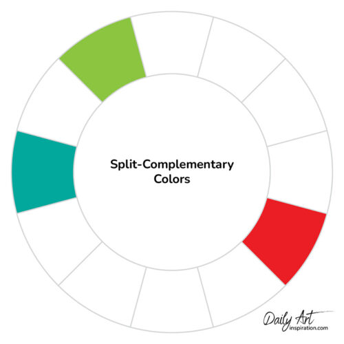
Split-Complementary Colors
A base color and the two colors adjacent to its complementary color, providing contrast with less tension than direct complementary colors.
Drawing Idea 1: A sunset landscape with shades of blue, orange, and yellow.
Drawing Idea 2: A peacock illustration using green, purple, and orange hues.
Drawing Idea 3: A stylized dragon using blue, red-orange, and yellow-orange hues.
The Psychology of Colors
Colors evoke emotions and influence perception. Here are some common psychological associations:
- Red – Passion, energy, and urgency.
- Blue – Calmness, trust, and professionalism.
- Yellow – Happiness, optimism, and creativity.
- Green – Nature, growth, and harmony.
- Purple – Luxury, creativity, and mystery.
- Orange – Warmth, enthusiasm, and excitement.
- Black and White – Classic, timeless, and elegant.
How to Apply Color Theory in Everyday Life
Understanding color theory can enhance various aspects of life and work. Whether you are designing a website, decorating a home, or choosing an outfit, applying color theory can make a significant difference. Here’s how:
Fashion & Personal Style: Selecting the right color combinations for your outfits can enhance your personal style and confidence. For example, wearing complementary colors like blue and orange can make a bold statement, while monochromatic outfits create a sophisticated look.
Interior Design: Colors in your home or workspace influence mood and productivity. Soft blues and greens promote relaxation, while warm yellows and oranges create a welcoming atmosphere.
Graphic Design & Branding: Businesses use color psychology to influence consumer behavior. Fast-food chains often use red and yellow to stimulate appetite, while financial institutions opt for blue to evoke trust and reliability.
Art & Creativity: Artists use color harmonies to create depth, mood, and visual appeal in their work. Understanding color contrast and balance allows for more impactful compositions.
Marketing & Advertising: The right colors can draw attention to ads, logos, and packaging. Bright, high-contrast colors often make products stand out, while softer tones convey elegance and sophistication.
Tips for Practicing Color Theory
If you’re new to color theory, here are some simple ways to apply it to your creative work:
- Experiment with Color Palettes: Use digital tools like Adobe Color, Coolors, or Procreate to test different color schemes.
- Observe Nature: The natural world provides incredible color inspiration. Study sunsets, flowers, and landscapes to see how colors blend harmoniously.
- Use a Limited Palette: Start with a small set of colors and expand as you become more comfortable with mixing and matching hues.
- Learn from the Masters: Study famous paintings, graphic designs, or fashion pieces to see how professionals use color.
- Practice with Coloring Books: Adult coloring books allow you to experiment with color combinations in a stress-free way.
As I mentioned earlier, I have created a color theory practice sheet which you can download here or by clicking on the button.
Mastering color theory doesn’t have to be overwhelming. By familiarizing yourself with the color wheel, experimenting with different harmonies, and understanding the emotional effects of colors, you can improve your visual compositions and design choices. Start practicing with simple color schemes and observe how different colors interact in your daily surroundings.
Now that you have a solid foundation in color theory, what will you create next?


